My logo design process kicks off with getting to know my clients—whether we’re chatting in the office or sipping coffee together. I love diving into brainstorming sessions, and yes, I’ve definitely got my fair share of sketches on paper napkins! Once I’ve got a good feel for the project, I jump into secondary research—scanning websites, collecting print materials, and checking out real product samples.
Then it’s time for the fun part: design! My notebooks fill up fast with wireframes and low-fi drafts. The best part is when I finally get to create the high-fi designs—the sweet spot where it all clicks. When it’s presentation time, I usually have three or four variations ready to go. Clients get the full experience with everything from packaging prototypes to product literature, and for stores, I’ll throw in mock-ups for signage and store materials too. It’s a whole vibe!
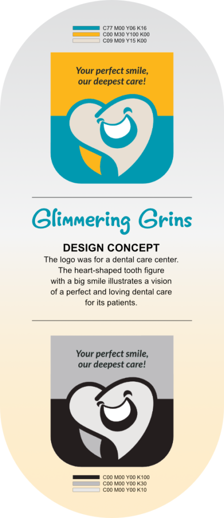
The Glimmering Grins Dental Care Center project focuses on branding and design for an acquired dental practice. The target audience is primarily children and families, with the mission of creating a warm, welcoming, and enjoyable environment for children’s dental care. The goal is to ensure that every child leaves the center with a bright, glimmering smile, fostering a positive dental experience for young patients and their families.
Through strategic marketing initiatives, consistent messaging, and engaging customer experiences, the aim was to further solidify the practice’s reputation, attract new patients, and foster long-term relationships within the community.
GOALS AND OBJECTIVES
The goal was to visually rebrand a recently acquired dental practice that already boasted a loyal client base, established service offerings, well-equipped facilities, and a dedicated staff. This involved crafting a unique and recognizable image for the practice that reflects its values, ethos, and commitment to exceptional dental care.
BRAND IDENTITY
Glimmering Grins envisions itself as more than just a dental practice. It aims to become a cherished establishment known for its unwavering dedication to caring for children and cultivating smiles that will accompany them on every adventure life brings their way.
While the adult demographic undoubtedly comprises a substantial portion of its clientele, Glimmering Grins recognizes the importance of forging a profound connection with children.
To achieve this, the practice has embarked on a journey to infuse its brand identity with elements specifically tailored to appeal to young hearts and minds. This includes incorporating a vibrant color palette reminiscent of joyous childhood moments, employing playful and whimsical fonts inspired by beloved cartoons, and adopting a lively and upbeat tone that resonates with the boundless energy and enthusiasm of youth.
By weaving these elements into its brand ethos, Glimmering Grins endeavors to create a warm and welcoming environment where children feel not only comfortable but also excited about their dental visits, paving the way for a lifetime of positive oral health habits and confident smiles.
BRAND GOALS
Establish a joyful, approachable brand that resonates with children and their families.
Reinforce the clinic’s deep commitment to dental care with an emphasis on creating lifelong positive dental experiences.
Update the clinic’s visual identity (logo, color scheme, signage) to better communicate the friendly, professional, and caring environment the center embodies.
DESIGN DEVELOPMENT
PROBLEM:
Glimmering Grins is a newly acquired dental practice that needs to promote a kid-friendly image because they aim to motivate parents to have their kids receive care from the center.
GOAL: Our logo design aims to make both parents and children feel comfortable going inside the dental center. This will help keep their patronage by giving them a view that the center provides the best dental care not only for their children but also for adults like them.
WIREFRAMES
Initial wireframes
The first sketches reflected the client-requested color palette. The client rejected the screw depicting implants and asked for the regular tooth back root instead. They liked the idea of a grinning tooth, and a particular sketch was picked for further development.
Iteration 1: Hi-Fi Drawing
The color palette was applied. The client wanted some teeth included in the logo.
Iteration 2: Wireframe
The teeth addition was approved. High fidelity versions of the logo were prepared. Additional options were submitted for selection.
High Fidelity Drawings
Hi-Fi 1 Colors: Bluegreen, Crimson Red and Gold
The powerful dark hues were intended to suggest power and formality. When accented with Gold, which represents success, the color scheme gives the center a potently attractive character which assures patrons of the organization’s strength and trustworthiness.
Hi-Fi 2 Colors: Purple and Baby Blue
This color scheme wants to please adult patients with a sweet color combination that exudes sophistication.
Hi-Fi 3 Colors: Teal, Pearl White and Golden Yellow
This light autumn-inspired palette gives off that light, playful feeling often felt with kids!
APPROVED LOGO
FB MARKETING
Back
Next
Let's talk!
Find out how my design expertise can add impactful experiences to your team—see what I can bring to the table!